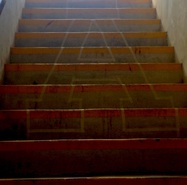
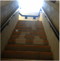
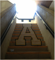
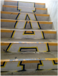
| At the beginning of the week, we had to build a tower made out of only newspaper and masking tape. I enjoyed this project a lot because it was simple, but at the same time you had to put a lot of thought into your design. Your tower had to be the tallest, but it also had to be sturdy. My group decided to work on the sturdy aspect first. We built a really strong base, and then began building it up. This plan backfired a bit for two reasons. One, we took too long to build the base so we didn't get it very tall. Two, our base was not even that strong for all the work we put into it, so the tower ended up short and lopsided. I still enjoyed this project a lot though. For my artists steal project, Sarah and I decided that we would overcome the challenge of perspective. We were going to make the Apex High "A" logo on the stairs. At first, we thought that the main issue was going to be getting the A to look like and A from the bottom of the stairs, but that quickly became the least of our worries. We started by lining the tape up as an outline. I put the tape down on the stairs and Sarah told me how to move it. After we accomplished that much, we had to ask permission to paint it onto the steps. We went to administration and asked them if it would be alright to paint them. They said that since the stairs had a lot of traffic, we would be better off chalking it instead. This was a minor setback, but not the end of the world. It would just take a lot longer and a lot more effort on our part to make it appear smooth. We began to chalk inside the tape white, but didn't get to finish. When we got back the next day, someone had removed the tape. Only half of our A had been colored in, so we had to get more tape and re-line in back up again. So far this was set back #3, but we were too far in to quit. We continued to color after we go our lines back, and eventually finished the white inside and the yellow and black outline. Originally we were going to put the word "Cougars" In the center of the A like the original logo, but our middle strip was split between 2 steps. We quickly figured out how difficult it was going to be to get cursive letters to line up between 2 steps, and we did not need a set back #4, so we decided not to risk it and left the inside plain. Overall, I am really happy with how this project and I think our perspective line up is impressive and believable. | 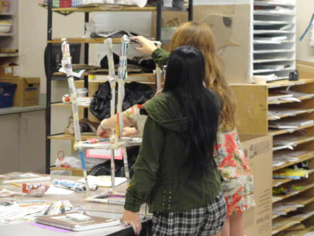
|
 RSS Feed